Whether you are from Tulsa or not, this Speakeasy website case study can help you and any company thinking about creating a website with some tips and tricks of web design. When the client came to me, the goal of the site was to create less questions for them to manually answer and for their website to be a place of information for prospects and ultimately to weed out those who were not serious about booking.
When creating a website, no matter the industry, the end goal is to drive sales and business, whether that is through e-commerce or being information driven. When designing a website you must take this into consideration and make the site as user friendly as possible while also creating an aesthetically pleasing experience for them.
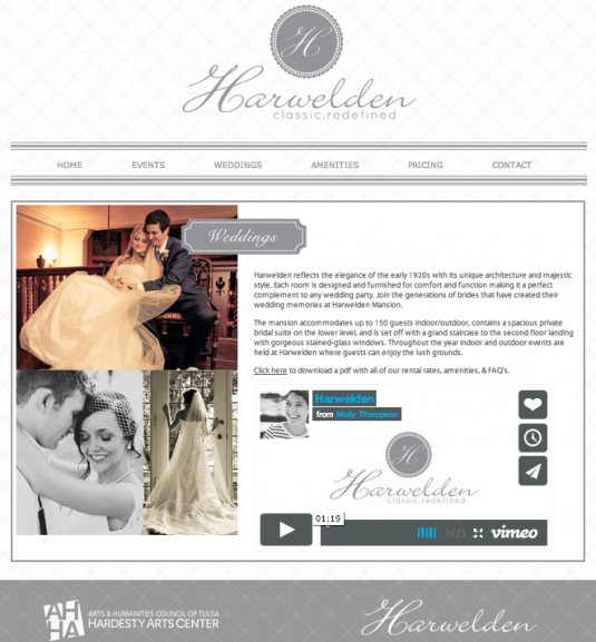
Now lets take a look at the before and after shots of a well known event and wedding venue here in town, Harwelden Mansion which Speakeasy has the pleasure of working with.
Before Speakeasy
After Speakeasy
Now what were some keys to success with this new website and how it meet client needs. Let's take a look:
- Easy to navigate - Whether you are wanting to host an event or wedding, it is very clear to the user which areas of the site are meant to meet your needs through large buttons on the homepage. You do not have to slide through banners but are able to quickly find what you need in a short amount of time.
- Branded logo - Before Speakeasy came in, the mansion had an image of a concrete "H" that is located on the actual building. Although it is a lovely image, it is difficult for that to translate digitally and use on promotional products like business cards, brochures, etc. Speakeasy came in a revitalized the logo to create something that would work well for them in print and web material, as well as something that people would begin to recognize as representing Harwelden Mansion.
- Clean design - The previous website was full of content that was irrelevant to prospects booking the venue and much of this excessive information cluttered the homepage. We condensed and rewrote content to fit their needs and get to the main points that would meet the needs of clients. The site now allows people to easily find what they need and does not overwhelm their eyes.
- Use of Imagery - This venue is a Tulsa icon and needed to be shown in a new light. Through the use of updated photography and including images of recent events and brides, the mansion can now be seen in a new light as something that is appealing to more generations and their target market.
- Social Media - Yes, of course brides and events need to be represented on social media. The previous website made it difficult to find the social media icons. The clean design of the new website makes it easy for visitors to interact with their social media and even share the content, such as the Pinterest "Pin" images option throughout the site. The more people you can get to share your brand the more awareness and ultimately sales you will generate.
- Removal of contact form - the removal of the contact form within every page of the site helped to filter out prospects that were not fully interested in the venue. Prospects that truly want to know about the venue have to make the conscious effort to contact the venue by navigating to the proper page, which means they will spend more time clicking through the site.
Now to recap what are some keys to a successful website?
- Ease of use - the ability for visitors to quickly and easily be able to navigate your website in as few clicks as possible....because lets be honest we are all busy and don't have time to click through a million pages to get information we need online.
- Branded design - your website needs to represent your company and its brand...period. Across your web platforms, (website, social media, etc) your brand need to be consistent.
- Drives sales - Your website is a sales tool, which means you need to treat it as such. Make sure your website directs visitors to meet your goals and to be able to easily do business with you.
- Create a fan base - Allowing visitors to interact with your brand via social media will begin to foster a group of cheerleaders and brand advocates for your company. Of course you must interact and create a reason for them to vouch for you with your social media...but that is a post for another day.
As you can see the revitalization of Harwelden Mansion, a Tulsa icon is now ready for the next generation of events and weddings. But a website is merely a stepping stone in the marketing of a business. If this post helped you or opened your eyes to the next steps for your digital marketing feel free to share it. If you would like a FREE consultation and review of your current digital marketing contact us today to get started. Creating a website and marketing plan should not be a daunting task, so let Speakeasy Market Strategies help!
The Marketing Dame


